            far below average below average average above average
  no degree                21            81     165            52
  degree                    4            34      74            54

            far above average  DK
  no degree                 2   5
degree 8 0Hypothesis tests pt 4
Lecture 16
Aidan Combs
Duke University
SOCIOL 333 - Summer Term 1 2023
2023-06-14
Logistics
- Introducing George
Grades are up to date
- Feedback in GitHub (issues on component 2 repo), grades on Sakai
- Check your feedback—you’ll revise what you did and use it in the final paper
- Extra credit will be added up and factored in at the end
Project component 3, results: draft by tomorrow (June 15), submit for grading by next Tuesday (June 20)
- Instructions and example are on the website
- Drafts should be complete–meaning you attempted all parts
- Commit your changes and push to GitHub!
Today
- A note on bar charts for proportions
- Review yesterday’s exercise
- Specifics of particular hypothesis tests
Bar charts for two categorical variables
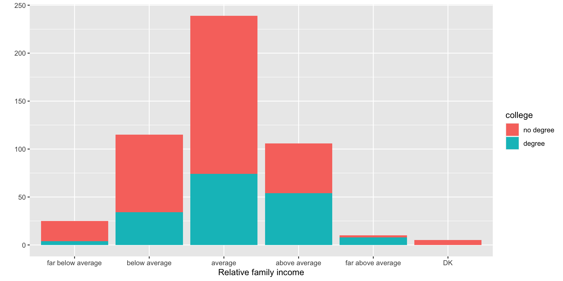
- Example: How is the probability of obtaining a college degree related to self-identified income category?
Bar charts for two categorical vars
- Example: How is the probability of obtaining a college degree related to self-identified income category?
- Stacked bar chart: Good at showing the overall distribution. We can see that most people think their income is average.
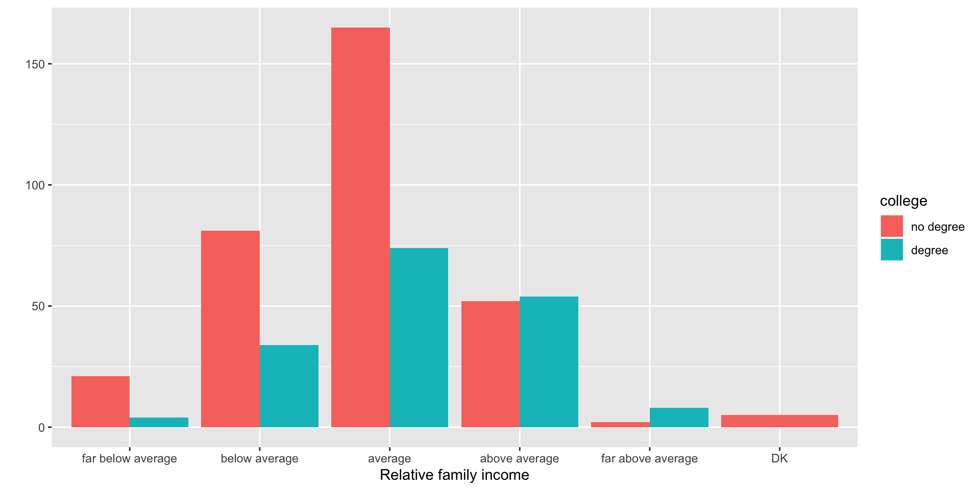
Bar charts for two categorical vars
- Example: How is the probability of obtaining a college degree related to self-identified income category?
- Dodged bar chart: Good at showing the distributions of the two groups next to each other. Now we can see that there are fewer people with degrees.
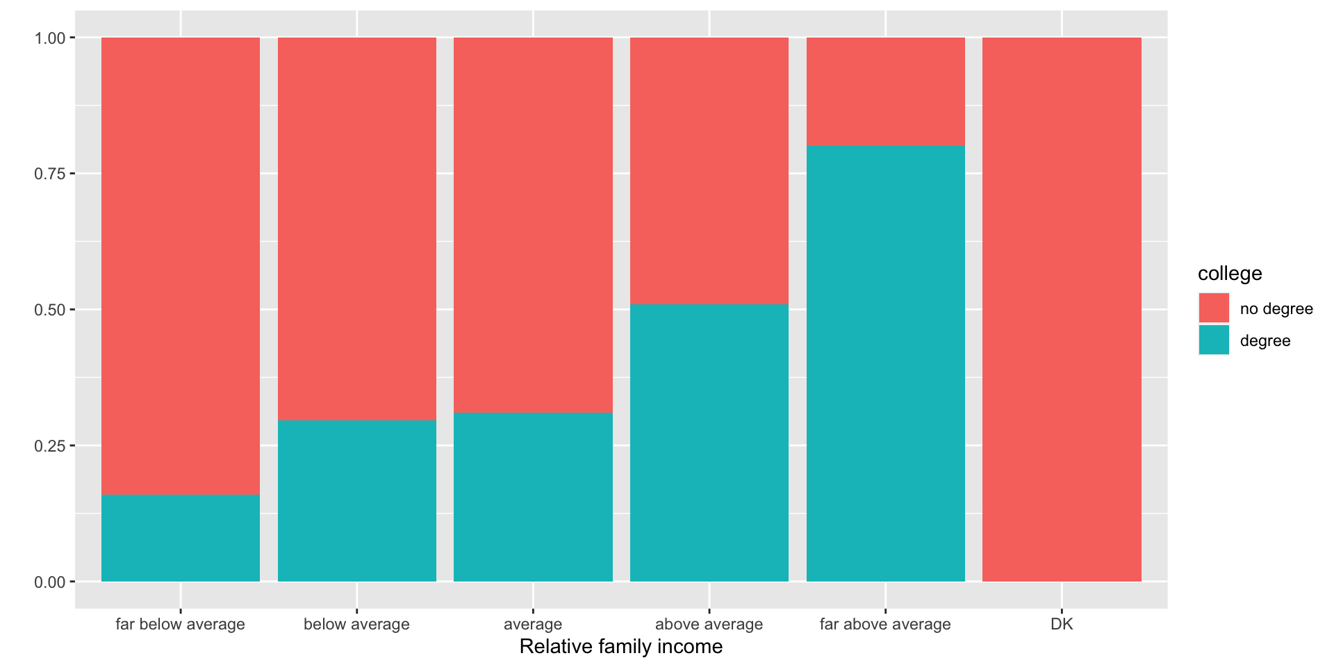
Bar charts for two categorical vars
- Example: How is the probability of obtaining a college degree related to self-identified income category?
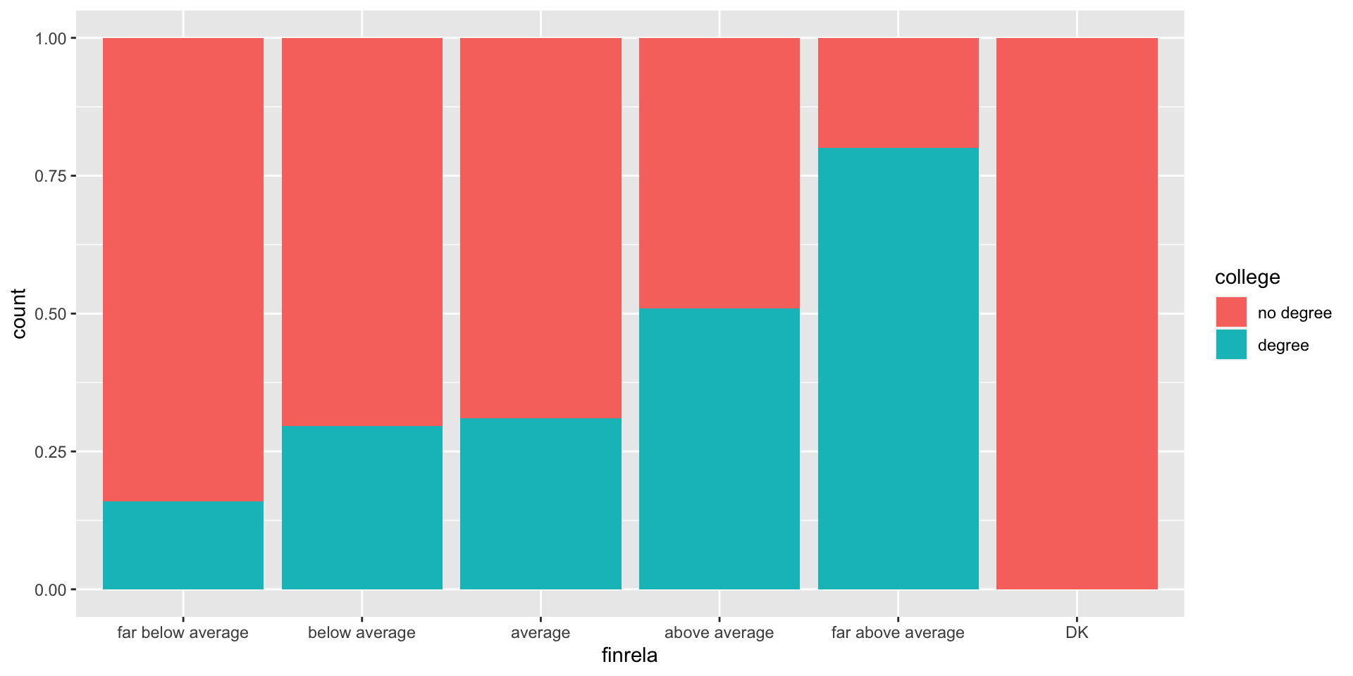
- Proportion bar chart: Good at comparing the compositions of the bars. We lose information on the distribution as a whole, but we gain information on whether people from both groups are evenly distributed between income classes.
Answers for exercise Q3
- How is someone’s gender identity related to their probability of being married?
Where we’re at with hypothesis testing
There are many types of tests
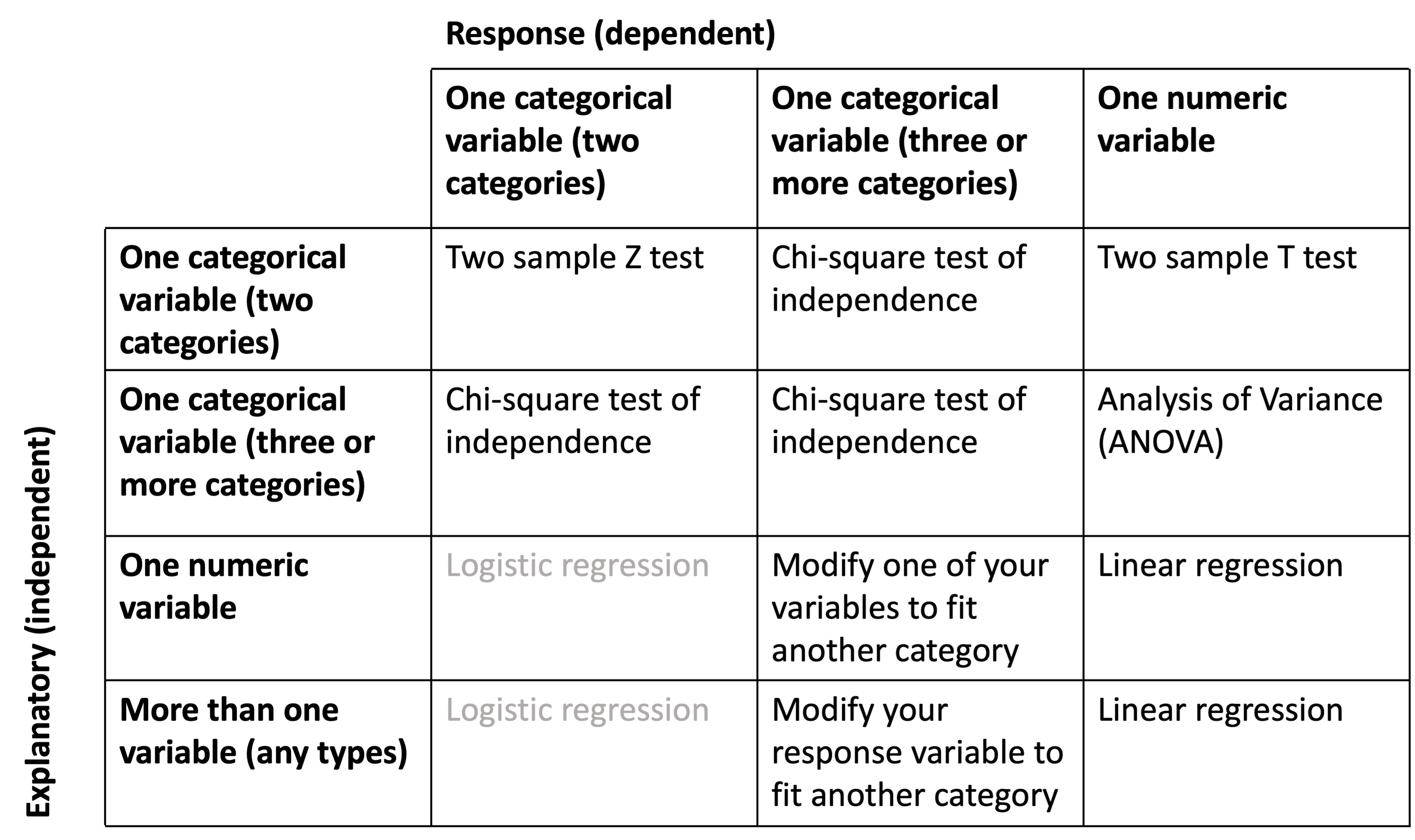
But the steps to run them are the same
Calculate the test statistic of your sample
- with
specify()(telling R what your variables are), - then
hypothesize()(telling R what kind of null hypothesis you have), - then
calculate()(calculating your test statistic)
- with
Simulate the null distribution
- exactly the same code as step 1, but with an added
generate()step - here you are simulating pulling a bunch of samples from your null population in order to figure out what the null distribution of sample statistics would look like
- exactly the same code as step 1, but with an added
Calculate the p value of your sample
- with your null distribution, your test statistic, and
get_p_value()
- with your null distribution, your test statistic, and
Visualize the test statistic of your sample alongside the null distribution
- with
visualize()andshade_p_value()
- with
In code form:
# 1. Calculate test statistic
test_stat <- XXXX |>
  specify(explanatory = XXXX,
          response = XXXX) |>
  hypothesize(null = "independence") |>
  calculate(stat = XXXX)

# 2. Simulate null distribution
null_dist <- XXXX |>
  specify(explanatory = XXXX,
          response = XXXX) |>
  hypothesize(null = "independence") |>
  generate(reps = 1000) |>
  calculate(stat = XXXX)

# 3. Use both to get the p value
get_p_value(null_dist,
            obs_stat = test_stat,
            direction = XXXX)

# 4. Visualize it!
visualize(null_dist) +
  shade_p_value(obs_stat = test_stat,
                direction = XXXX)
What are the different tests testing?
Different tests: an overview
We’ll be covering 5 specific hypothesis tests (all except logistic regression)
- Two sample Z test
- Two sample T test
- Chi square test of independence
- Analysis of Variance (ANOVA)
- Linear regression
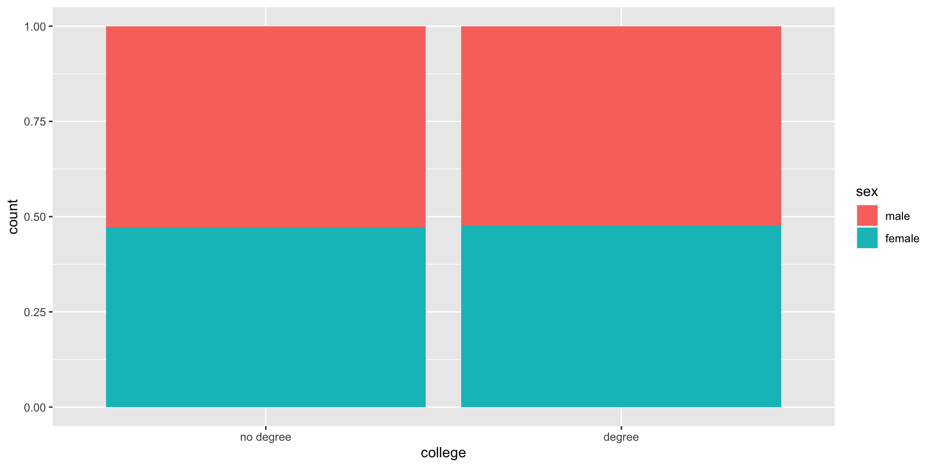
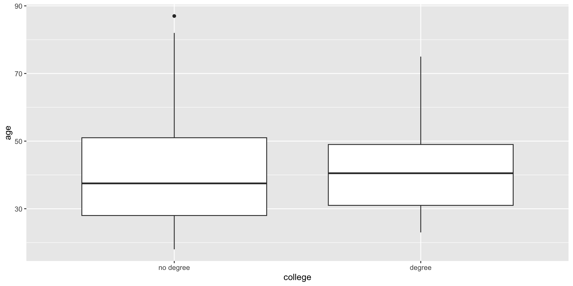
- There is a relationship between the descriptive plots you’ve been working with and the different test types!
Two sample Z test
- Explanatory: categorical with two categories
- Response: categorical with two categories
- Testing for: Difference in group proportions!
Two sample T test
- Explanatory: categorical with two categories
- Response: numeric
- Testing for: Difference in group means!
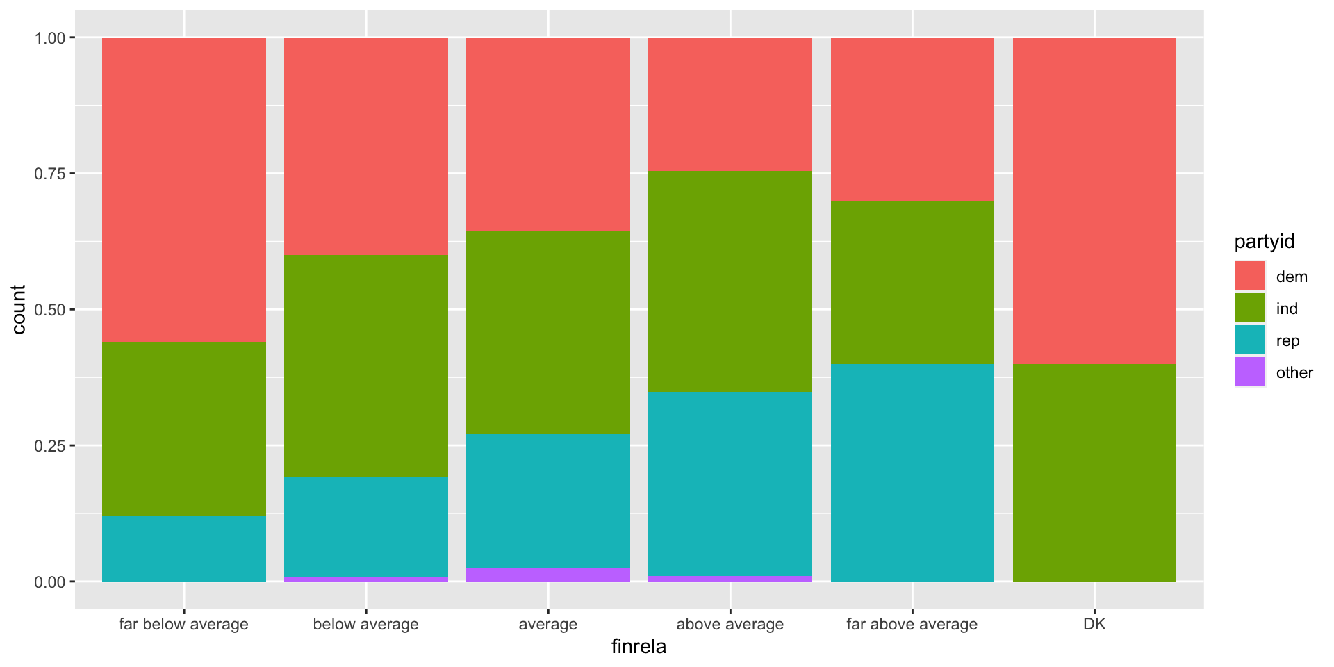
Chi square test of independence
- Explanatory: categorical with any number of categories
- Response: categorical with any number of categories
- Testing for: Patterns in how observations are distributed between groups!
Chi square test of independence
- Explanatory: categorical with any number of categories
- Response: categorical with any number of categories
- Testing for: Patterns in how observations are distributed between groups!
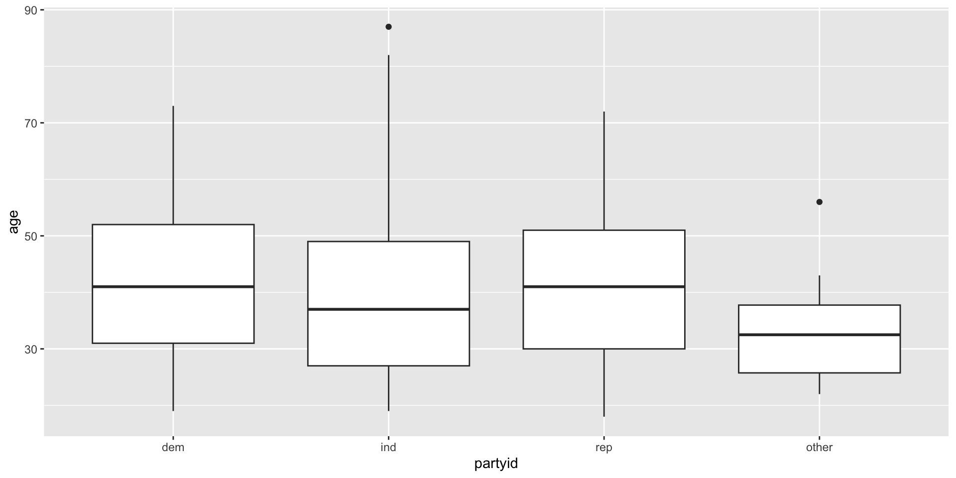
Analysis of Variance (ANOVA)
- Explanatory: categorical with three or more categories
- Response: numeric
- Testing for: Differences in means between more groups!
Linear regression
- Explanatory: numeric or multiple variables
- Response: numeric
- Testing for: Non-zero slopes!

What’s the math difference?
What’s the math difference?
- Mainly, the shape of the test statistic distribution.
- We account for this in two places:
- the
statargument incalculate() - the
directionargument inget_p_value()andvisualize()
- the
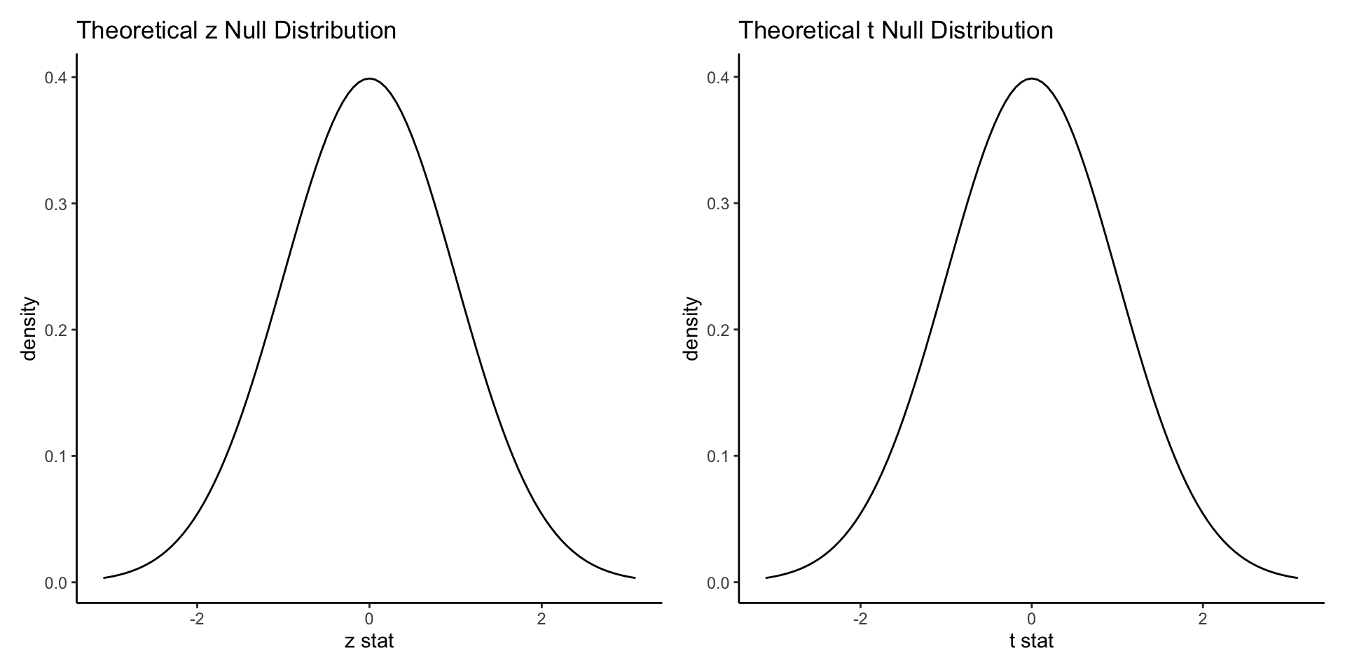
Normal and nearly normal distributions
- Normal: Two sample Z test, linear regression slope test
- Nearly normal (t distribution): Two sample T test
- Symmetrical; centered at 0; bell-shaped
- Either one-tailed or two-tailed tests make sense
Asymmetrical distributions
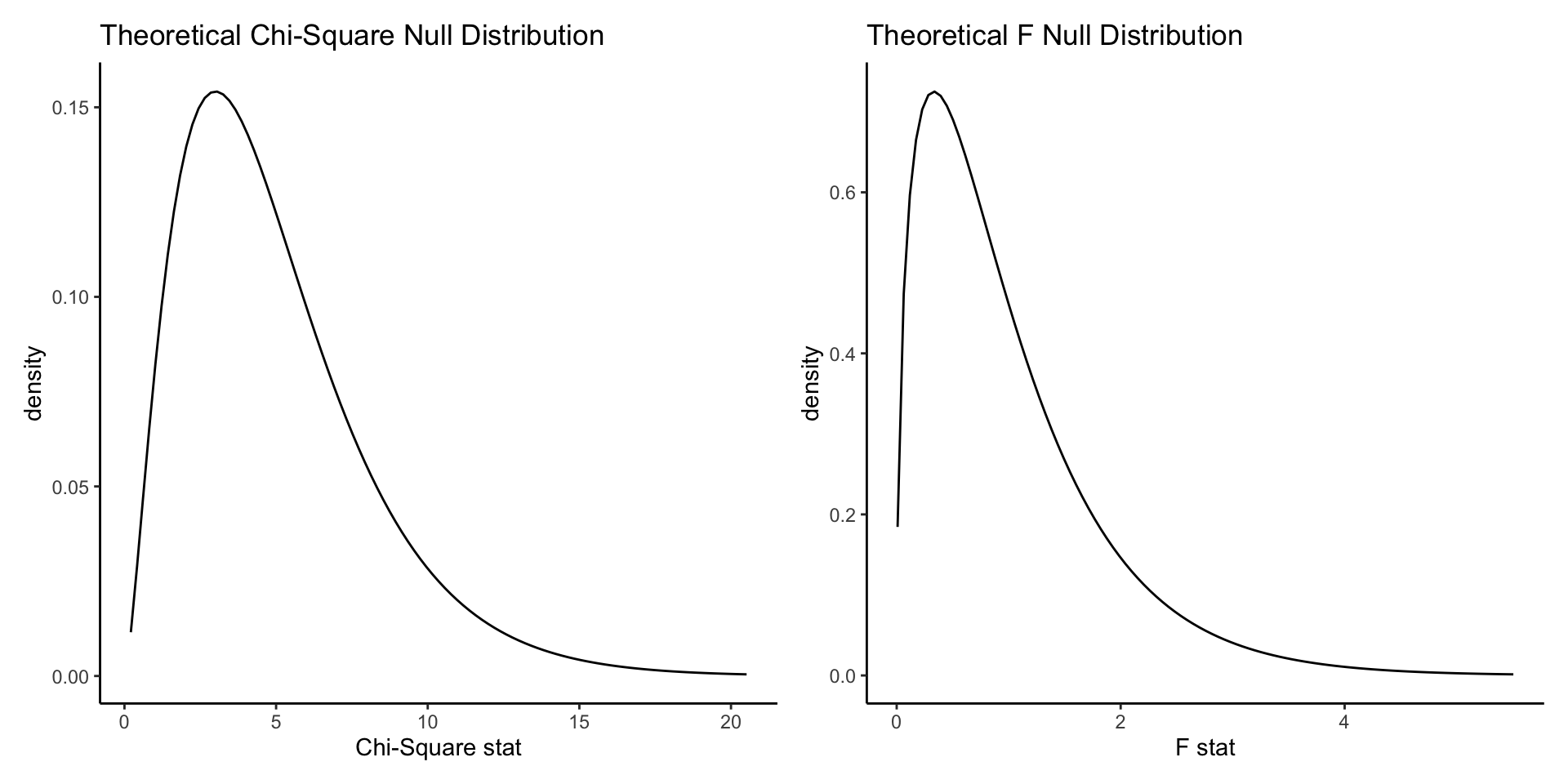
- Chi-square test: chi square distribution
- Analysis of Variance (ANOVA): F distribution
- These values can be thought of as distances
- Strictly positive; asymmetrical and long-tailed
- “More extreme” means further away—ie, more positive. So all tests are one-tailed.
Different tests: summary
| Test | stat = XXXX | direction = XXXX | Notes |
|---|---|---|---|
| Two sample Z test | "z" |
usually "two-sided" |
Needs success = XXXX in specify(), where XXXX is one of the options of the response variable |
| Two sample T test | "t" |
usually "two-sided" |
|
| Chi square test | "Chisq" |
"greater" |
|
| ANOVA | "F" |
"greater" |
hypothesize() optional for test statistic |
| Linear regression | "slope" |
usually "two-sided" |
hypothesize() optional for test statistic |
Example
- How is self-perceived relative family income associated with probability of receiving a college degree?
- Explanatory: Self-perceived relative family income. Three or more category categorical.
- Response: Whether or not someone received a college degree. Two-category categorical.
- Null hypothesis: There is no relationship between self-perceived relative family income and probability of receiving a college degree.
- Alternative hypothesis: There is no relationship between self-perceived relative family income and probability of receiving a college degree.
Example

Chi square example
- Correct test: Chi square

Chi square example
Chi square example
# 1. Calculate test statistic
test_stat <- gss |>
  specify(explanatory = finrela,
          response = college) |>
  hypothesize(null = "independence") |>
  calculate(stat = "Chisq")       # calculate the Chi square statistic
# 2. Simulate null distribution
null_dist <- gss |>
specify(explanatory = finrela,
response = college) |>
hypothesize(null = "independence") |>
generate(reps = 1000) |>
calculate(stat = "Chisq")Chi square example
# 1. Calculate test statistic
test_stat <- gss |>
  specify(explanatory = finrela,
          response = college) |>
  hypothesize(null = "independence") |>
  calculate(stat = "Chisq")       # calculate the Chi square statistic

# 2. Simulate null distribution
null_dist <- gss |>
  specify(explanatory = finrela,
          response = college) |>
  hypothesize(null = "independence") |>
  generate(reps = 1000) |>
  calculate(stat = "Chisq")
# 3. Use both to get the p value
get_p_value(null_dist,
obs_stat = test_stat,
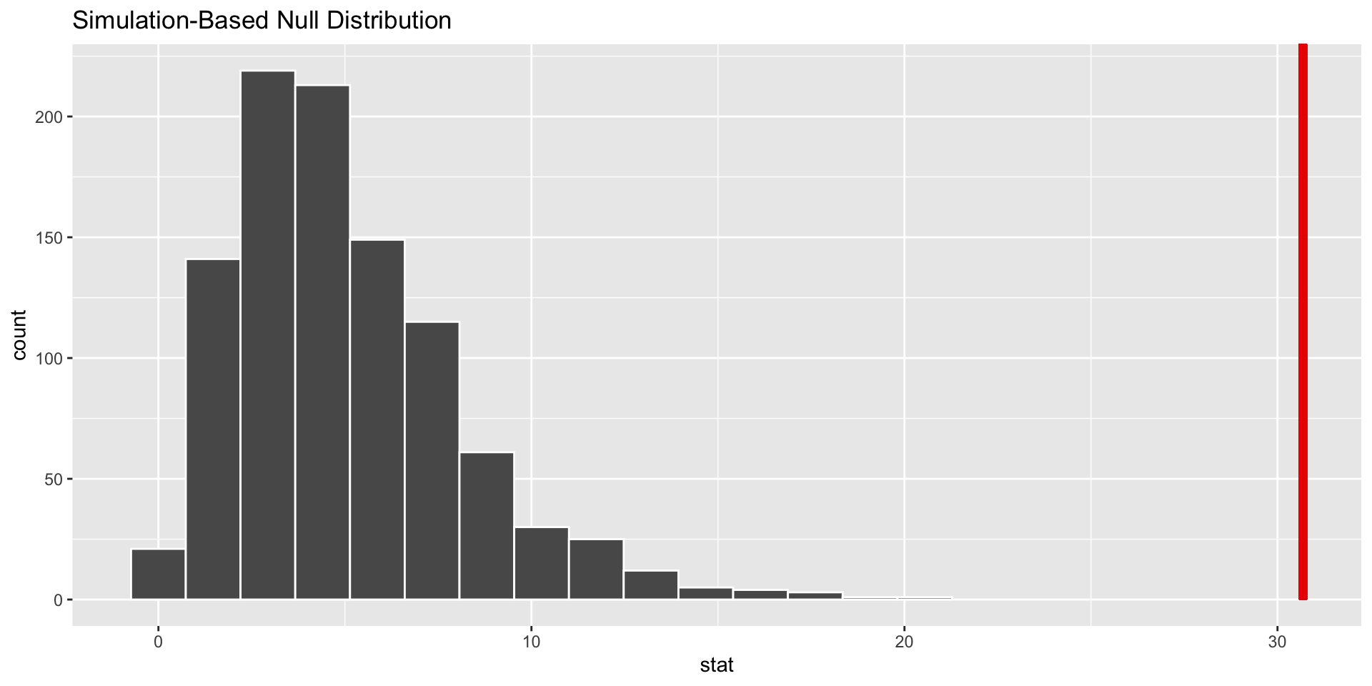
direction = "greater") # we want the probability of a statistic larger than what we calculated# A tibble: 1 × 1
p_value
<dbl>
1 0Chi square example
- Do we reject or fail to reject our null hypothesis?
- What can we conclude about our research question?
# 4. Visualize it!
visualize(null_dist) +
  shade_p_value(obs_stat = test_stat,
                direction = "greater")