Plotting relationships between variables
Lecture 12
2023-06-07
Factors
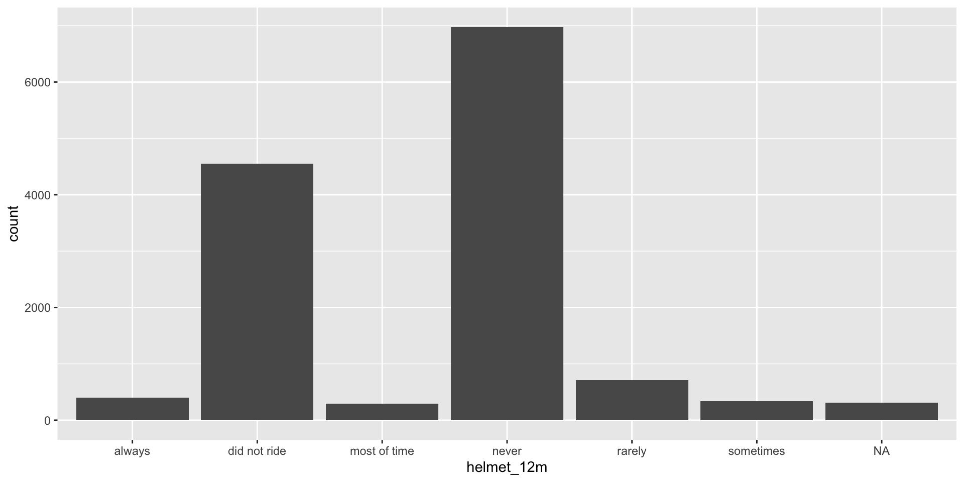
- Remember our bar plot of helmet wearing habits from the exercise:

Factors
- Categorical variables (those where the values are words/letters/numbers in quotation marks) default to being ordered alphabetically
Rows: 13,583
Columns: 13
$ age                      <int> 14, 14, 15, 15, 15, 15, 15, 14, 15, 15, 15, 1…
$ gender                   <chr> "female", "female", "female", "female", "fema…
$ grade                    <chr> "9", "9", "9", "9", "9", "9", "9", "9", "9", …
$ hispanic                 <chr> "not", "not", "hispanic", "not", "not", "not"…
$ race                     <chr> "Black or African American", "Black or Africa…
$ height                   <dbl> NA, NA, 1.73, 1.60, 1.50, 1.57, 1.65, 1.88, 1…
$ weight                   <dbl> NA, NA, 84.37, 55.79, 46.72, 67.13, 131.54, 7…
$ helmet_12m               <chr> "never", "never", "never", "never", "did not …
$ text_while_driving_30d   <chr> "0", NA, "30", "0", "did not drive", "did not…
$ physically_active_7d     <int> 4, 2, 7, 0, 2, 1, 4, 4, 5, 0, 0, 0, 4, 7, 7, …
$ hours_tv_per_school_day  <chr> "5+", "5+", "5+", "2", "3", "5+", "5+", "5+",…
$ strength_training_7d     <int> 0, 0, 0, 0, 1, 0, 2, 0, 3, 0, 3, 0, 0, 7, 7, …
$ school_night_hours_sleep <chr> "8", "6", "<5", "6", "9", "8", "9", "6", "<5"…
Factors
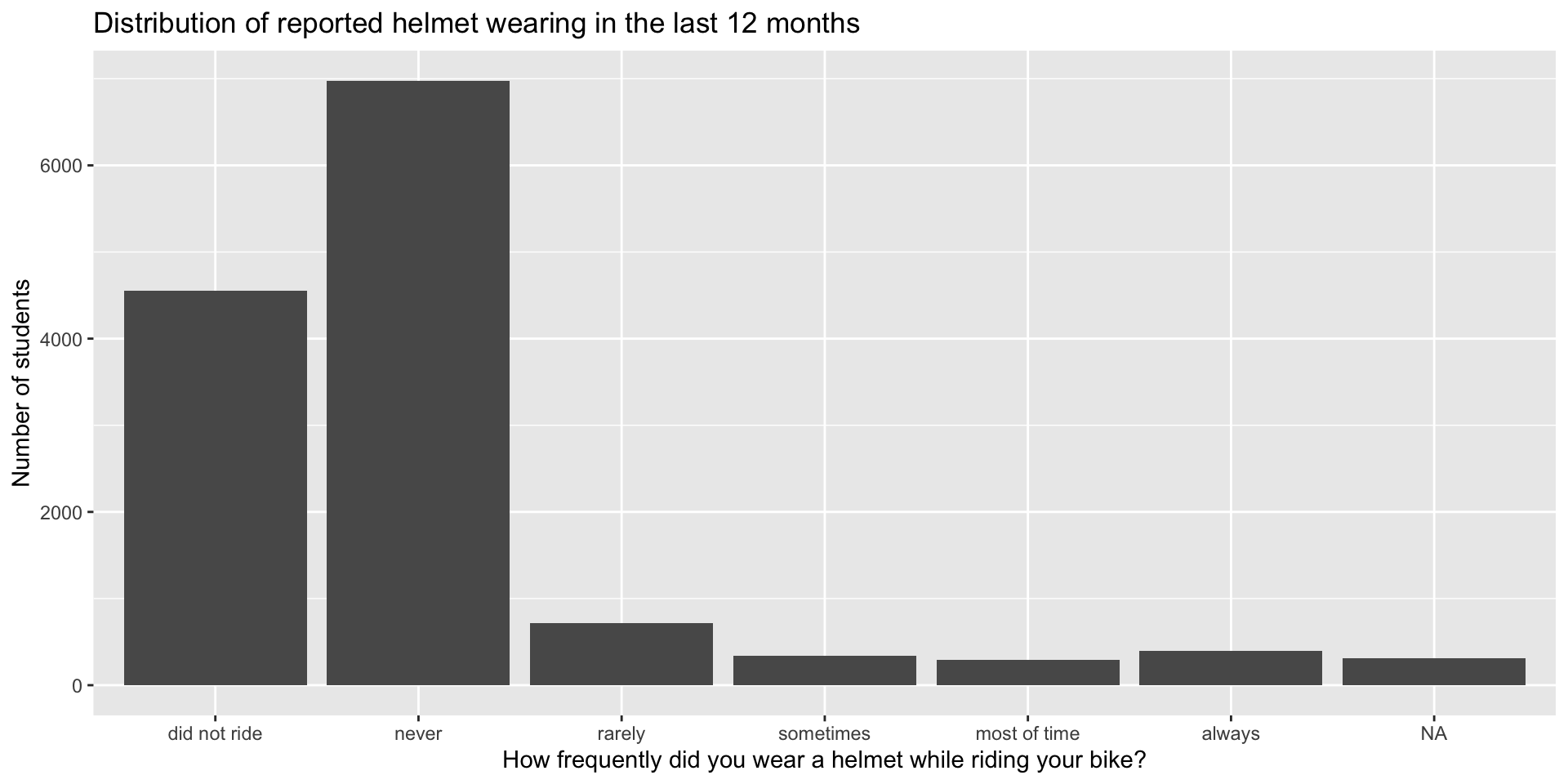
- Our new plot! I’ve added better labels as well.
- What is easier to see in this plot than the old one?
- Does the pattern surprise you?
Bar charts for two categorical variables
fill = genderis the argument we want for bar color (an area rather than a point or line)- This is an okay start, but it’s not super obvious yet what the story is
yrbss |>
  filter(!is.na(gender) & !is.na(text_while_driving_30d)) |> # remove missing data
  mutate(text_while_driving_30d = factor(text_while_driving_30d, # change the order of the bars
                                         levels = c("did not drive", "0", "1-2", "3-5",
                                                    "6-9", "10-19", "20-29", "30"))) |>
  # we add the fill argument here with the variable we want the fill color to represent.
  ggplot(aes(x = text_while_driving_30d, fill = gender)) +
  geom_bar()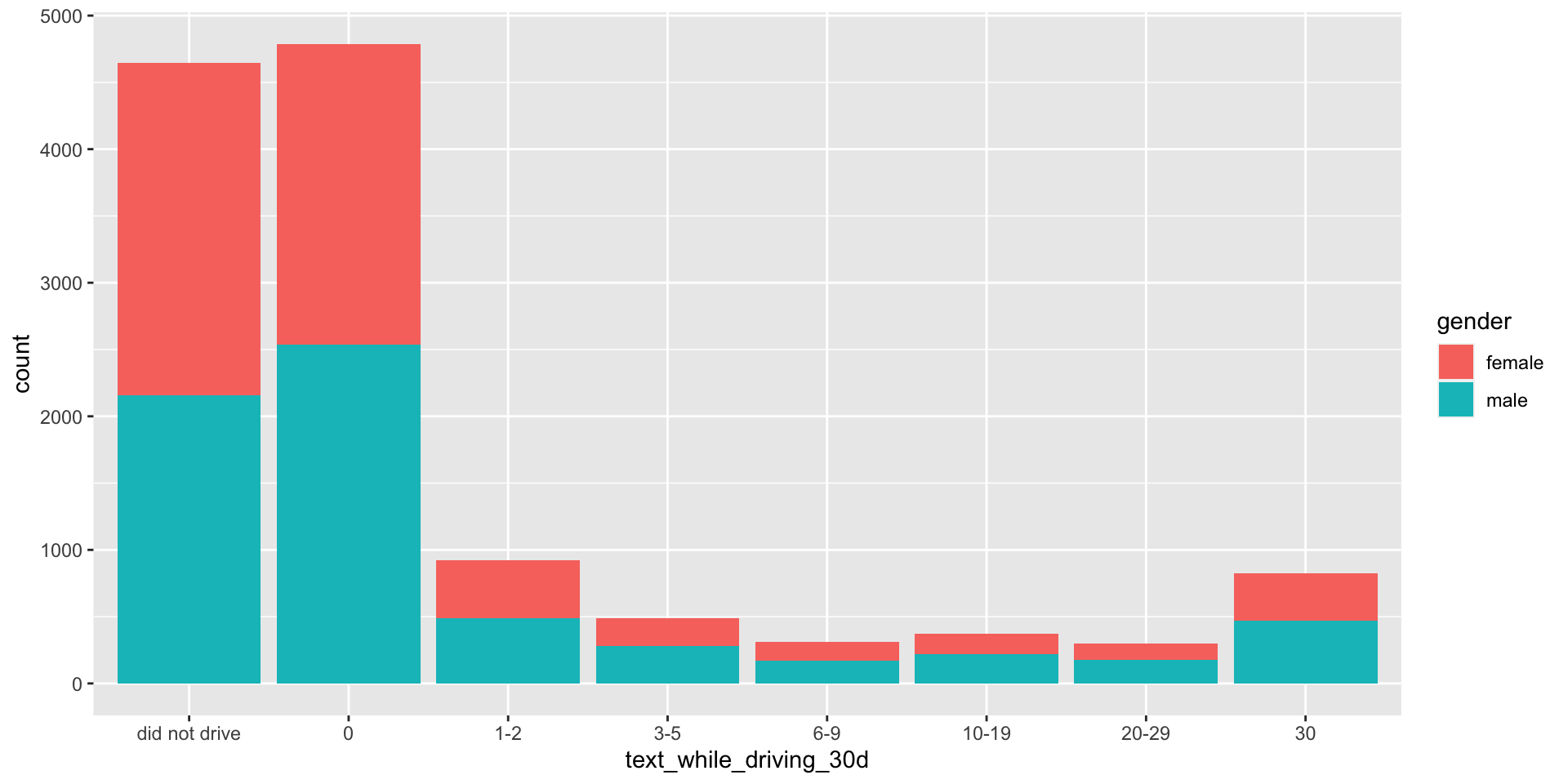
Bar charts for two categorical variables
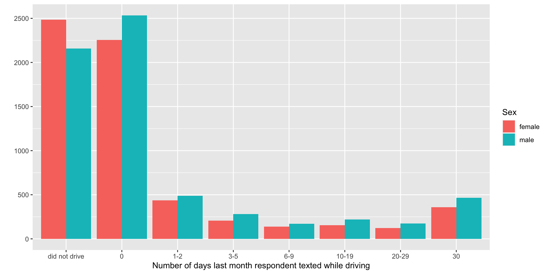
- Here the story is clearer!
Scatter plot
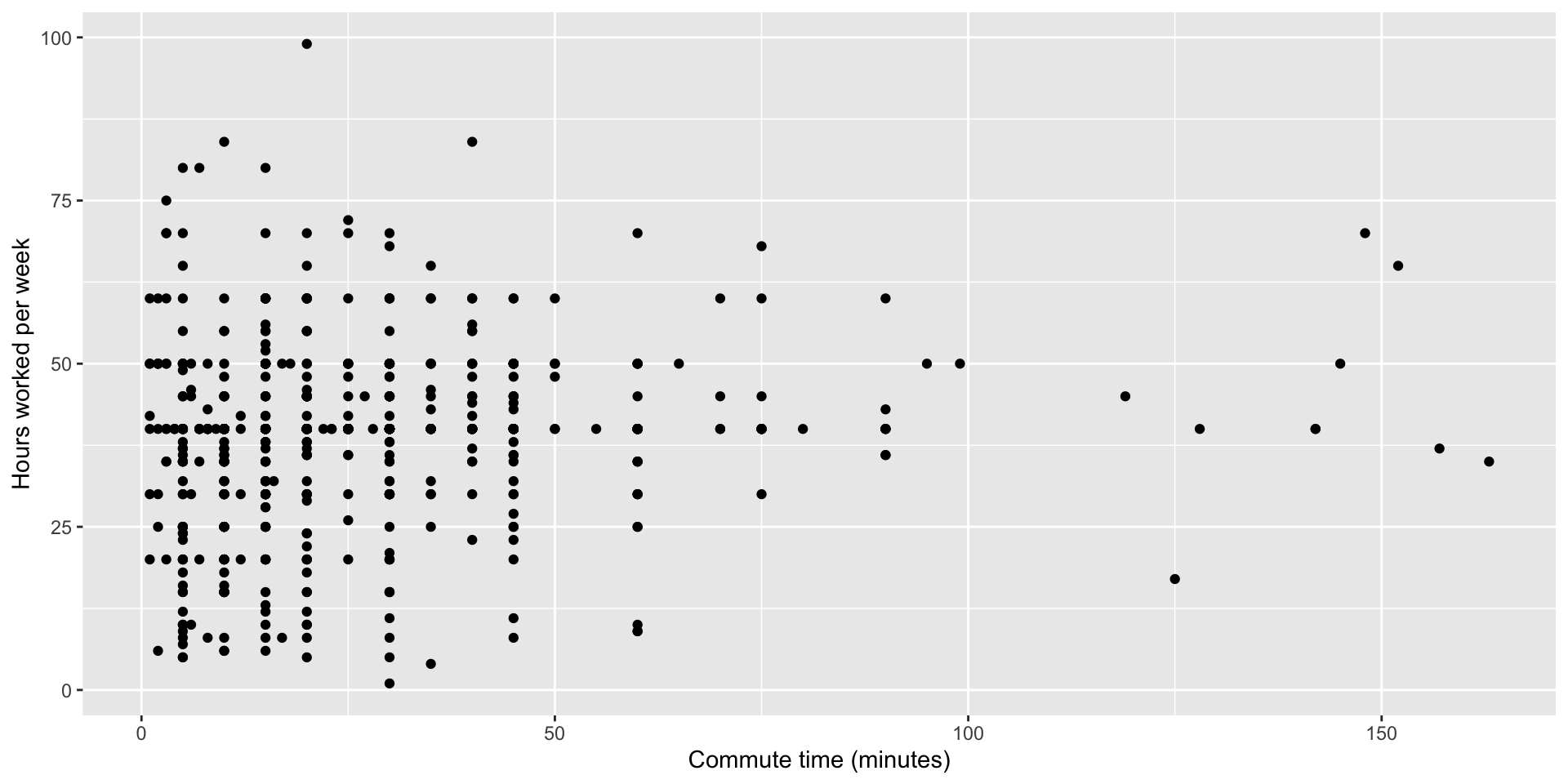
Scatter plot with color

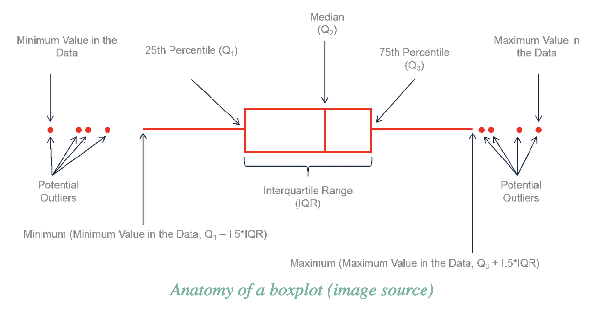
Box plots
- Box plots are good for showing the median, quartiles, outliers, and range of a variable.
- You can plot a single numeric variable using a boxplot, but they’re most useful for comparing the distribution of a numeric variable across different groups represented by a categorical variable.
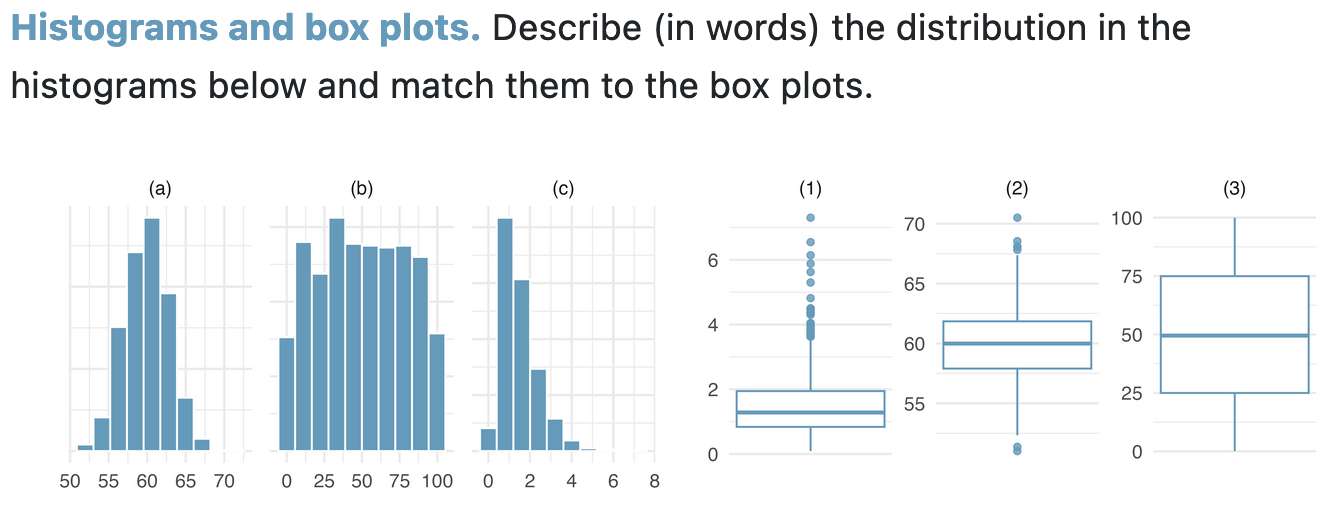
Box plots and distributions: exercise
Box plots
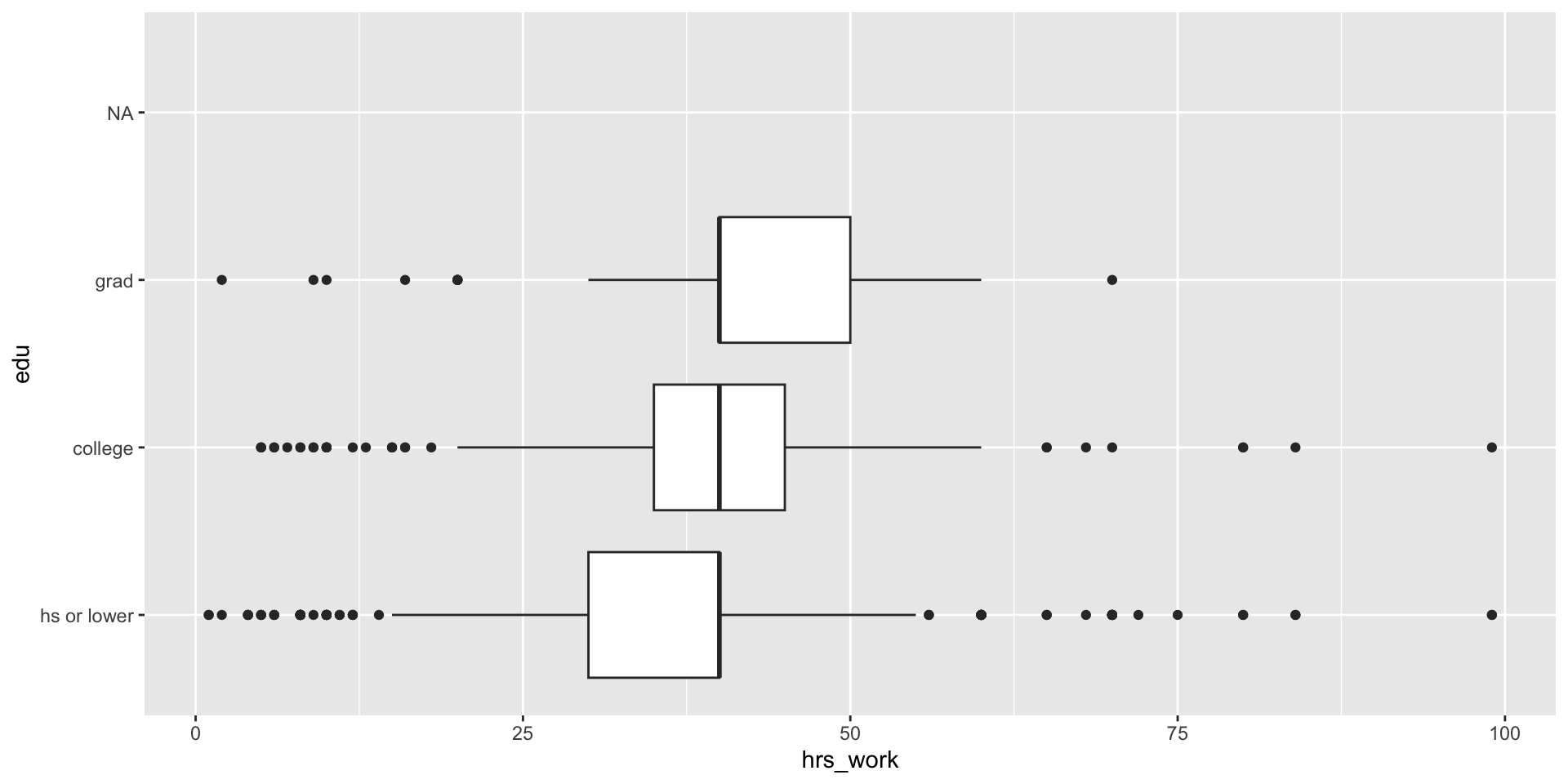
- Example: How does the number of hours worked per week vary by education level?
Three variables: Adding color to our boxplot
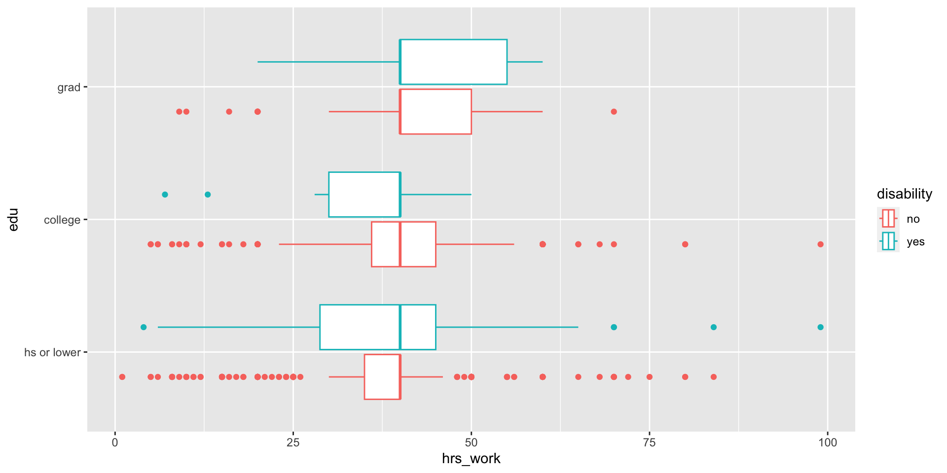
- RQ: Among people who report being employed, how does the relationship between education level and number of hours worked per week vary by ability status?
For tomorrow
- No exercise on multivariate plots
- Try out part 4 of your project instead! Come tomorrow with questions.