Plotting a single variable
Lecture 11
2023-06-06
Why plot?
Why plot?
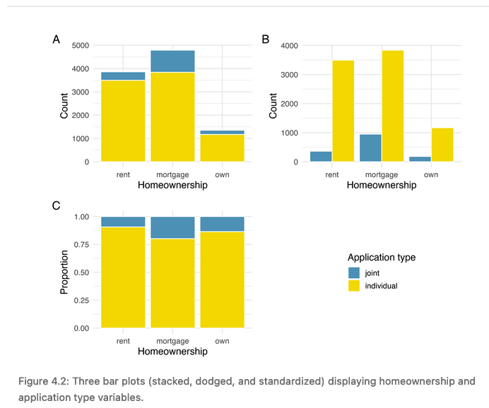
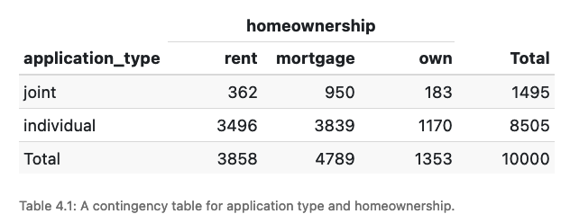
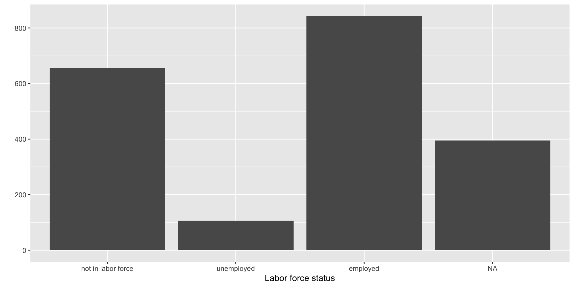
Categorical data: bar charts
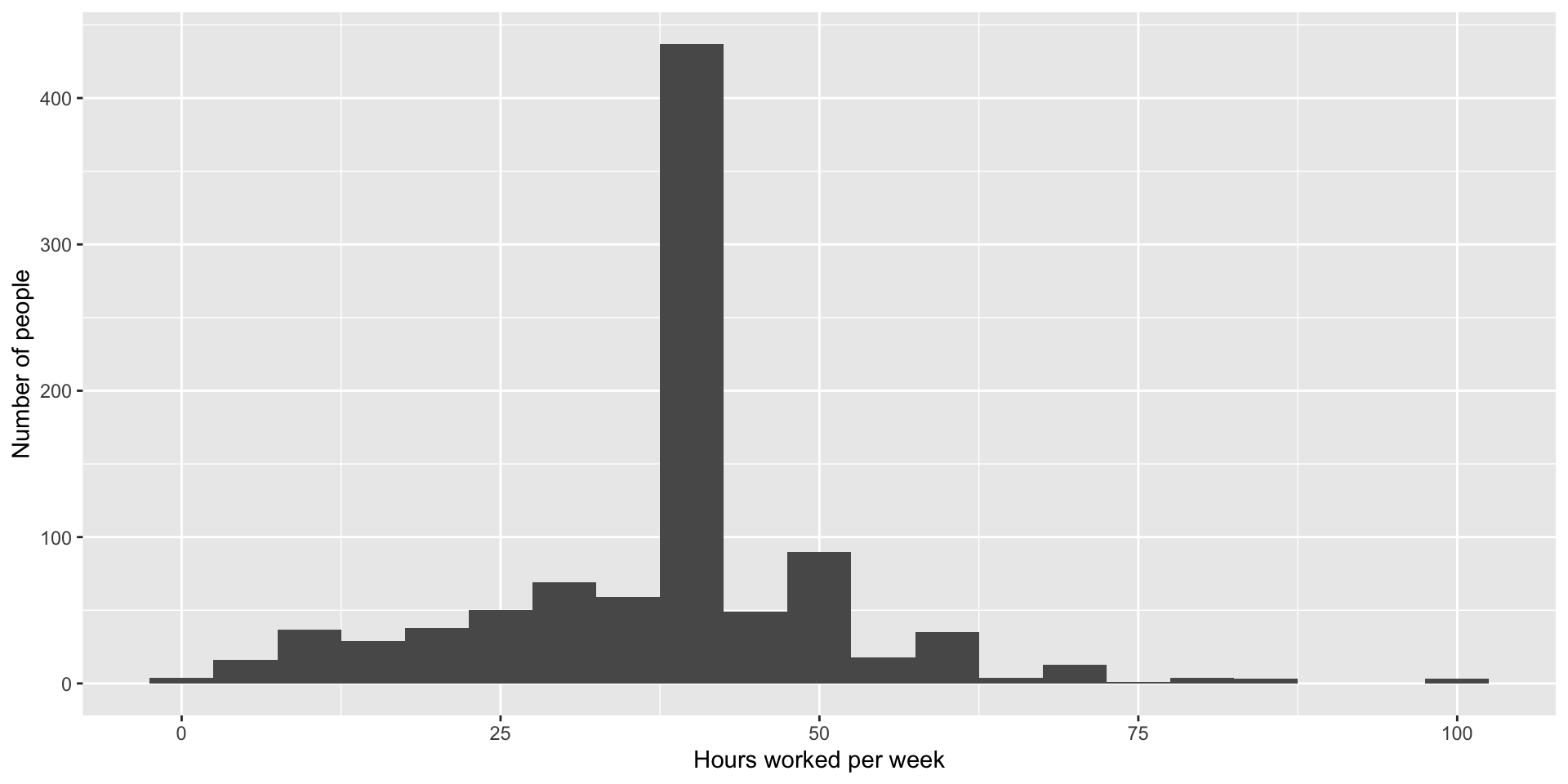
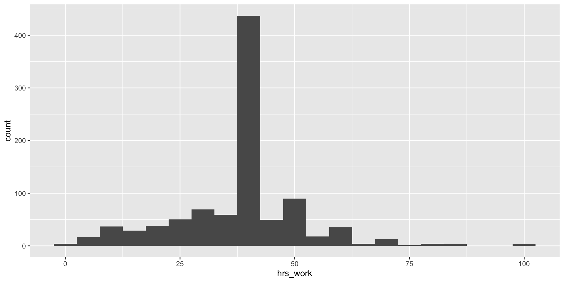
Numeric data: histograms
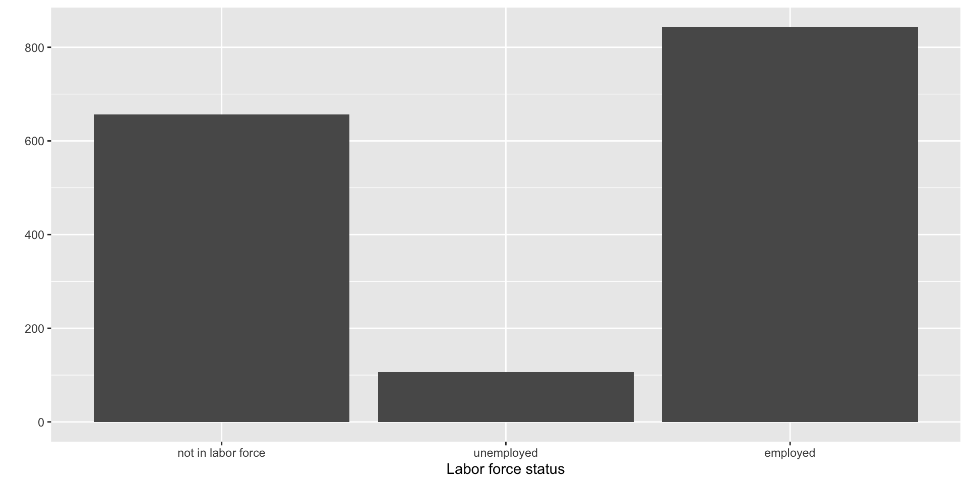
Back to the bar chart

- It’s there but it’s ugly!
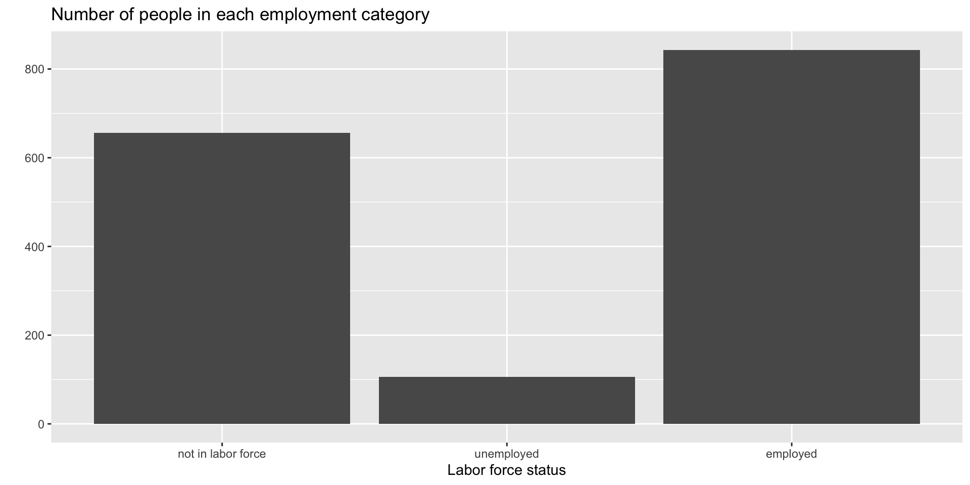
Cleaning up the bar chart
- Once we have a basic plot, we can add more elements to make it nicer
Cleaning up the bar chart
- We can use
filter()to get rid of them before plotting the data
# first we filter out the NAs
acs12_filtered <- filter(acs12, !is.na(employment))

# then we plot that new dataset
ggplot(data = acs12_filtered, aes(x = employment)) +
  geom_bar() +
  labs(y = "",
       x = "Labor force status",
       # and let's add a title too
       title = "Number of people in each employment category"
) 
Cleaning up the bar chart
- We could have also used a pipe to do the same thing in one command
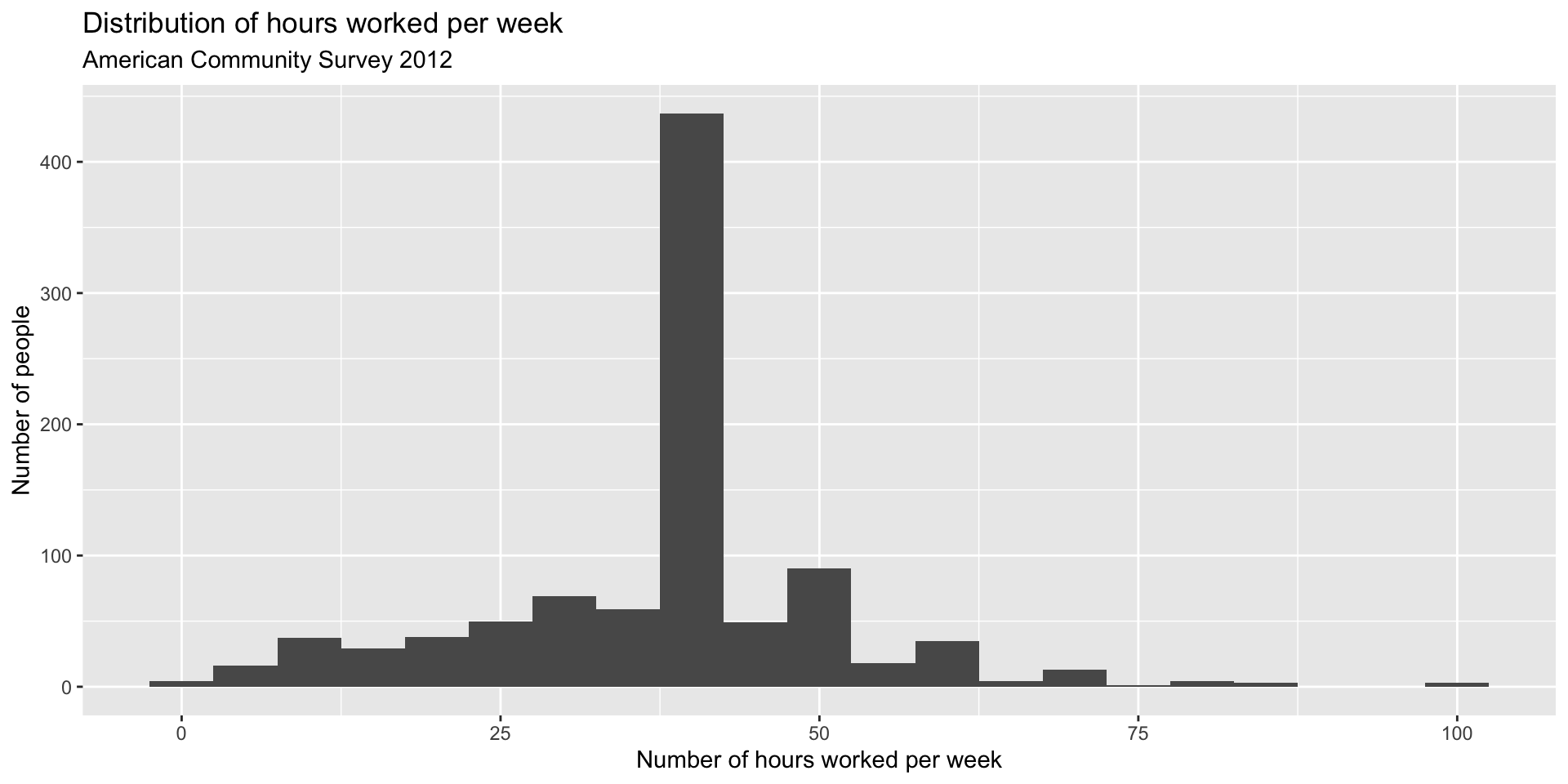
Back to the histogram
- It has exactly the same structure!
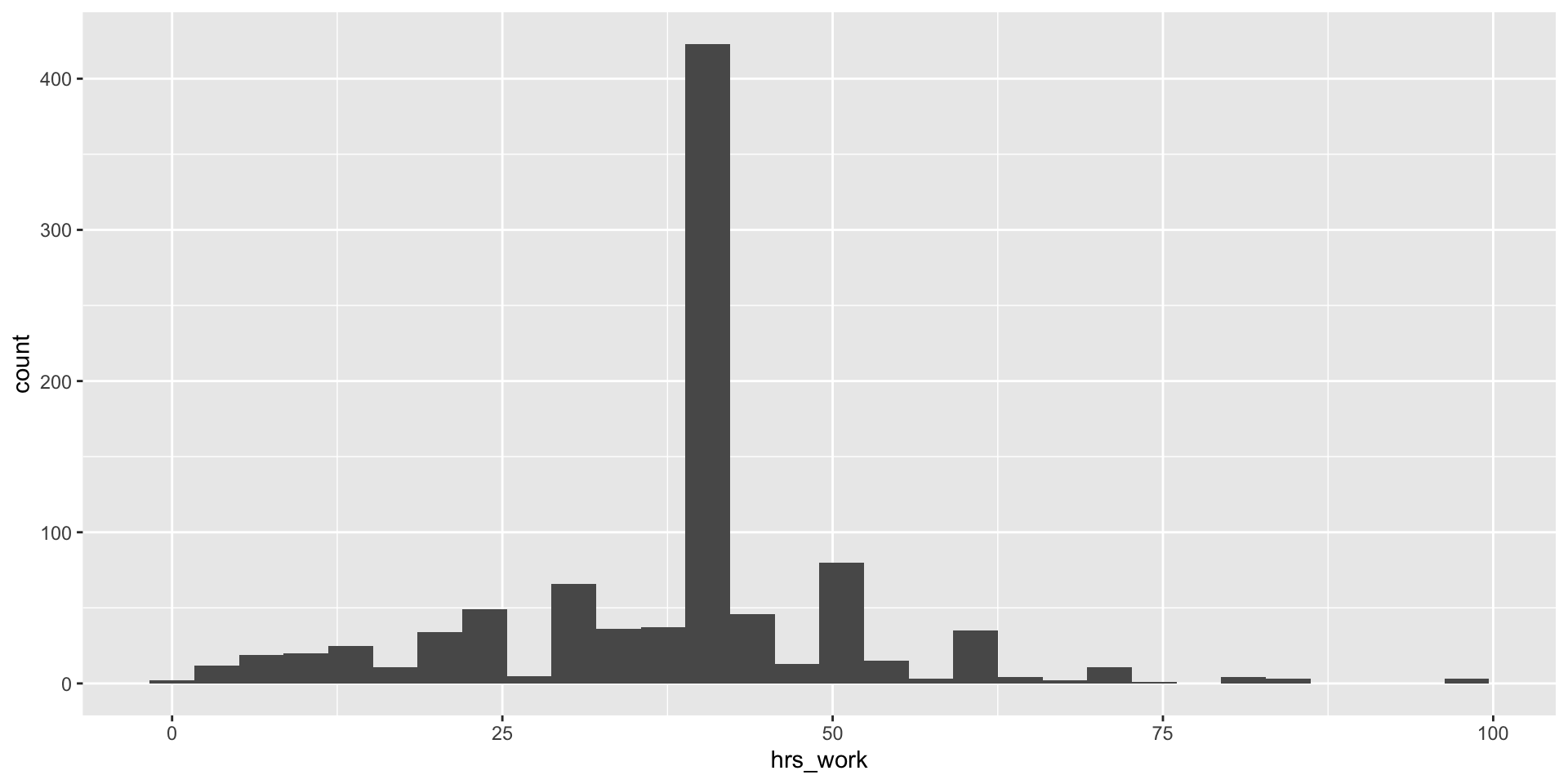
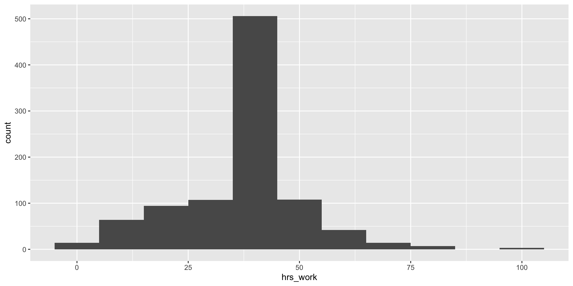
Cleaning up the histogram
- It’s better if we do that explicitly though
- Same as the bar chart, let’s filter out the NAs before plotting

Cleaning up the histogram
Cleaning up the histogram
- What if we picked 8 instead? (logic being that 8 is a standard workday)
Cleaning up the histogram
- What about 1?
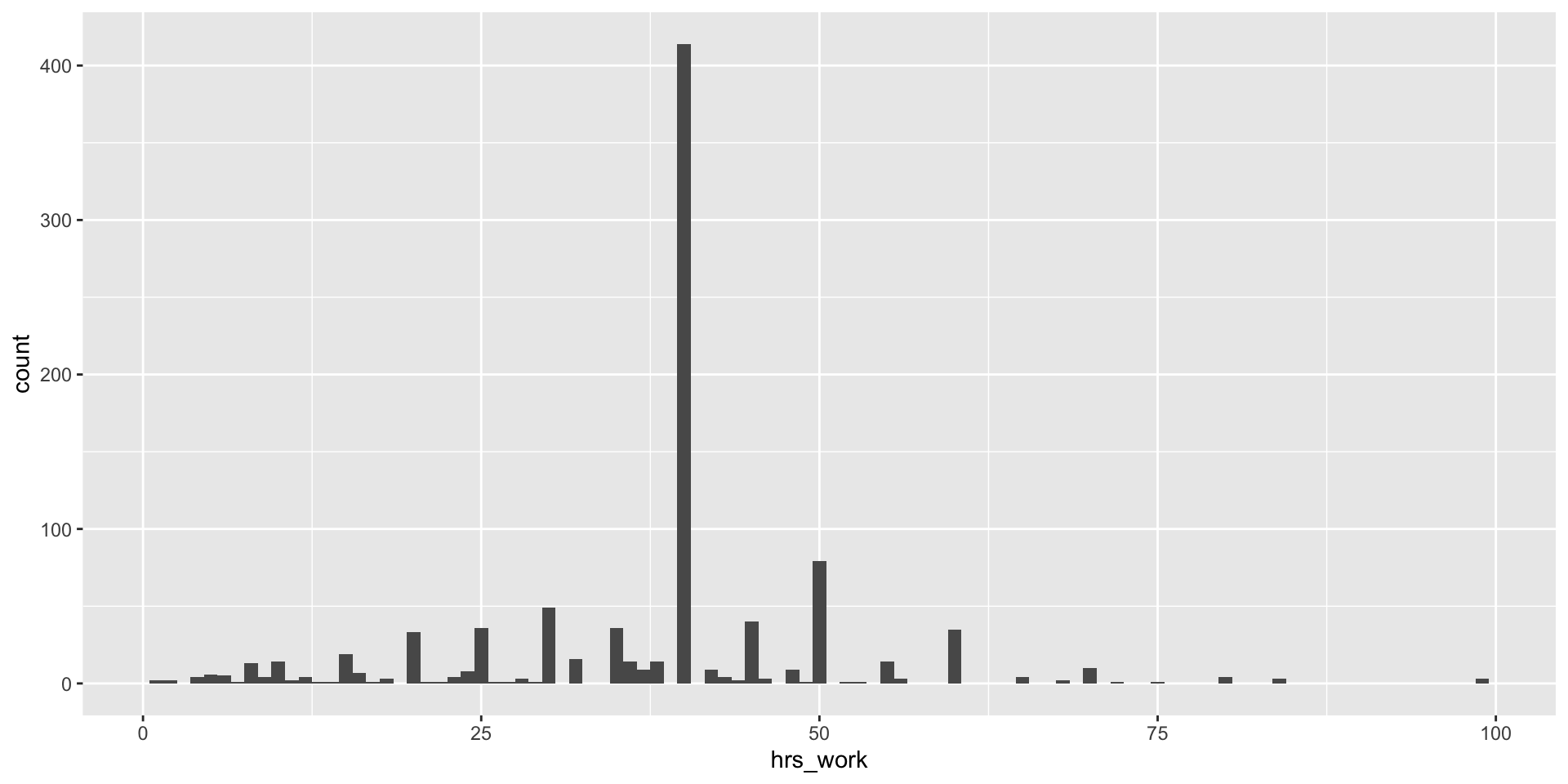
Cleaning up the histogram
- Now we’ve eliminated all the messages–let’s add labels!